6 minutes
One credit union’s account of successfully designing a new space around both practical needs and staff and member experience goals
The number and size of retail financial institution branches are declining, but due to such factors as mergers and growth, headquarters needs are increasing at thriving credit unions. Just 10 years ago, the ratio between HQ and branch staff was about 1:1—today it ranges between 2:1 and 2:5 at larger institutions like Citigroup and Deutsche Bank. The credit union ratio is also rising as focus on remote delivery strategies increases.
Along with this HQ growth comes the need for occupancy plans and real estate strategies that deliver on four big goals:
- flexible support of 20-year occupancy needs;
- on-brand experience for staff that attracts and retains the best employees and maximizes the branded experience for members;
- location that helps work/life balance; and
- reasonable occupancy cost.
$656 million Salal Credit Union recently completed its new headquarters just north of Seattle. It accomplished the above four goals and provides a useful example to others looking toward their future headquarters occupancy.
Salal CU had grown out of its existing building and needed a 20-year occupancy strategy. The CU projected multiple possible occupancy needs over the entire planning period based on a variety of business scenarios. Real estate options then underwent financial and experience analysis to see how they compared and to understand the impact on culture, efficiency and brand.
An existing office building came on the market. While it was about twice the size the CU needed for the first five years at 87,552 square feet, it was located in a historically and projected strong leasing market and adjacent to regional rapid transit. The site also included a 280-stall garage. The 20-year occupancy cost was calculated at about 25 percent of building a new headquarters.
CUES member Skott Pope, SVP/chief retail banking officer at Salal CU, was part of the team responsible for managing acquisition of the new headquarters. He was willing to share his experience.
Your delivery strategy has evolved, because your target market is dispersed over a large metropolitan area and because of your need to focus on developing powerful digital service channels. How has this impacted your headquarters?
SP: “Technology became a central component of our building—most importantly, how it improved our staff’s experience and interactions with each other. … We needed to create a corporate HQ that would have secure Wi-Fi and allow access to all systems, including the core, so that staff could move freely around the space to collaborate and work more efficiently.
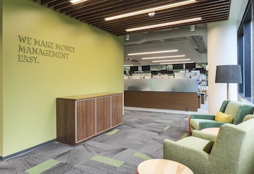 “Our space is designed to remind us of all the things we do to make money management easier for our members. We live our credit union core values and make decisions based on our vision of unlocking opportunities to improve members financial health. For example, Salal provides financing options through businesses that help members improve their homes and handle major repairs; these businesses depend on Salal to provide affordable financing to their customers in the simplest ways.”
How do you express these values to staff in the HQ?
SP: “The interior design has branded walls to remind us of these businesses and the members they serve. For example, on one wall we have incorporated roofing materials, HVA sheet metal, home siding and solar panels.”
Why did you select the specific location?
SP: “Seattle traffic has been and continues to be a growing issue in our ability to attract and maintain the most talented team possible. To lessen our staff’s commute as much as possible, we prioritized a location close to major transit centers.”
You occupy about half the building. What are the pros and cons of being a landlord?
SP: “A positive aspect is that we have a significant amount of space that we are able to lease, providing revenue and helping to subsidize the cost of the building. Obviously, as landlords, we have to develop additional expertise in managing property, dealing with leases and handling building concerns. … We lease our branch locations, so we translated the experience of being a leasee to that of a lessor.”
 What are the key design features?
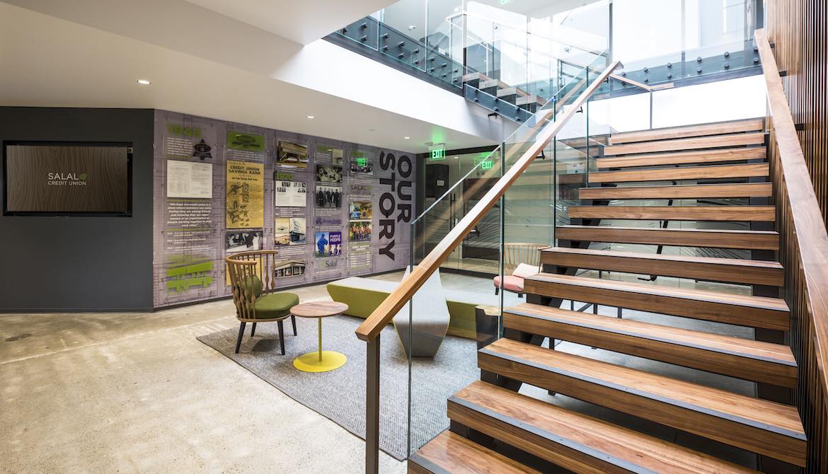
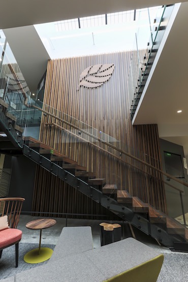
SP: “We spent a lot of time … thinking about the employee experience. We held focus groups and, working with our architect, put together different ideas for features in the building and tested them for employee reaction before designing. One of the most important things we determined was including an interstitial (between floors) staircase to keep two floors of people connected. We wanted to break down silos between groups, and having an elevator ride between two areas might mean that someone on a lower floor never saw someone on the floor above. Also key to the design was creating a common dining space and making it the only place where people could eat. No more eating at your desk. We made a beautiful café capitalizing on the views of the Olympics [a large mountain range to the west across Puget Sound].”
What are some of the issues you faced during the process of acquiring your building, selling your existing building, and selecting and working with a realtor and architect?
SP: “We had many challenges, but the one that stands out the most was timing. We had sold our previous headquarters and, due to delays in permitting and some design issues, we were delayed in moving to our new space. … We decided to add a fire sprinkler system to improve employee and tenant safety. The delays caused by poor communications by the City and slow permitting process kept us out of the building for a few extra months. Fortunately, we were able to convince the fire inspectors to let us move in before the fire sprinklers were connected. Unfortunately, it meant we could not use the café or our new boardroom for months after we moved in. There was no furniture in those spaces, and we set up a café in one of the empty spaces we were planning to lease so people could have a place to eat. Our SVP of HR called it ‘camping’ and we made it as fun as possible—even with that big beautiful café just sitting bare and being blocked by yellow and black ‘Do Not Enter’ construction tape.”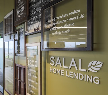
What advice would you give to other executives responsible for developing a new HQ facility?
SP: “Knowing what your goals are for the space is important. It cannot just be about making it more beautiful—because there are always tons of opinions about what looks good and what doesn’t. Focus on what you’re trying to accomplish—in our case it was employee experience and space efficiency. Don’t let the design stuff distract you from your goal—the colors and fabrics are fun and important, absolutely … but I would say that the conflicts over the carpet or tile samples are not as important as they seem in the moment.
“We had it in our minds to cut the staircase numerous times because of the expense, but our CEO kept coming back to the importance of the connection between everyone, reminding us that making it happen was as important as anything in our space. Now that we’ve been living in it, I can say had we ‘value engineered’ that out of our design, we would have lost the heartbeat and energy around our café ... separating half our staff from the other.”cues icon
Paul Seibert, CMC, is an independent facilities and real estate consultant under Paul Seibert Consulting, Seattle.


